Behavior, Simplified
Designing smoother behavior check ins for better care coordination
THE PROBLEM
At-A-Glance
Caregivers of children with autism, ADHD, and similar needs often struggle to track behavior incidents in a clear, consistent way. MyCuraJOY helps by providing a simple platform for logging ABC data (Antecedent, Behavior, Consequence), making it easier to identify patterns and share insights with therapists.
But our existing solution wasn't working because:
1
First-time users had trouble finding where to check in and were confused by seeing their avatars front and center
2
Important steps like add behavior labels or sharing check-ins with providers were often skipped
My Role
Product designer
Responsible for: design audit, interaction design, rapid prototyping, usability testing.
Team
Engineering Lead
Billy Franklin
Researcher
Lu Cai
Timeline
March - April 2025
The Solution
100%
Task success rate during user testing
Streamlined UX
No confusion or extra clicks to get behavior logs shared effectively
DEMO
At an AI conference which drew investor & partner interests.
RESEARCH
Discovering What Was Broken
When I tested the original behavior tracking flow and found myself confused, I suspect users would struggle too. Before jumping into redesign, I did a full audit of the experience and documented the key pain points we needed to fix.

HYPOTHESIS
Assumptions Behind The Redesign
Auto load recent behavior labels will simplify check-ins.
A clear homepage highlighting check ins as entry point will reduce confusion and drop-off.
Moving privacy settings to the end of the flow will make sharing easy to understand.
EXPLORATION
Backend Constraints
To redesign the check in flow, I first aligned with our engineering lead to understand why adding a behavior label to a check in required lengthy steps. Key takeaways from our meeting:
Why so many steps?
Users had to add a behavior label as a shortcut, then select it again to include in a check-in.
Clinical requirement:
Therapists usually track up to 3 behaviors at a time.
Parents may have custom behaviors to monitor.
Labels act as tracking assignments, so a predefined set needs to load each time.
Design opportunity:
Auto-load behavior labels from the backend to reduce manual work.
Show relevant behaviors in the suggestion list before search.

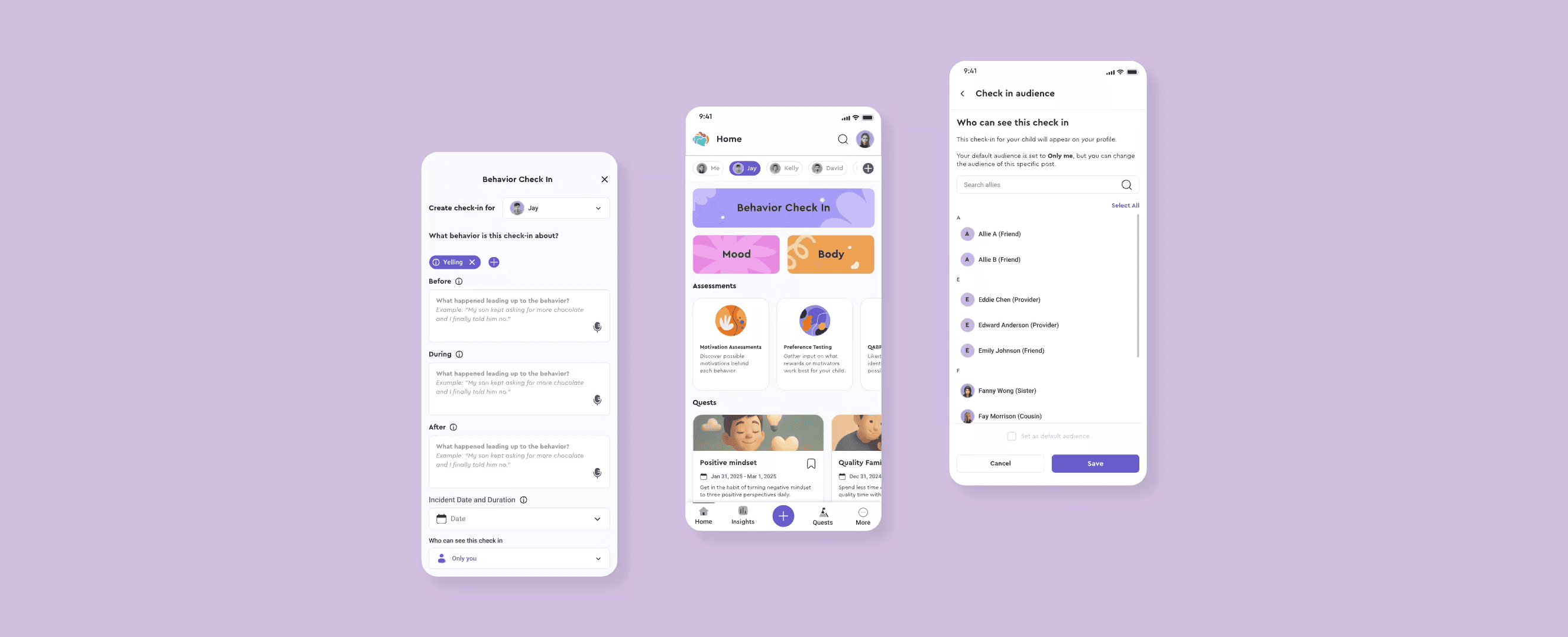
The Redesign
Prototype To Be Tested


USABILITY TESTING
Method And Goals
I collaborated with our researcher, Lu, to design and launch unmoderated usability tests on UserTesting for both the old and new designs.

Goal
Confirm if the new design improved ease of use

Participants
Parents and caregivers of kids with behavioral challenges

Method
Task-based, unmoderated usability testing

Sample Size
20 users total; 10 users per version (no repeat users)
I planned for follow-ups if fewer than 70% completed tasks—but didn’t need them.
Test Results
New Design
100%
successfully logged behaviors
100%
shared check ins with providers without issues
Old Design
0%
successfully logged behaviors
10%
shared check ins with providers without issues
User Quotes
"Looks like a great tool to be very detailed and organized. It looks very easy to learn to use."
yeyi5
"So my first impressions to this homepage is very positive. This is a short homepage. It looks very cute, attractive, and I think it's very easy to understand the different sections and different contents."
victorlee
"So first, I love the fact that each person can have their own profile and then you can add more. I like that. I love the assessments. It seems like a pretty decent app to kind of help you gauge if your child's behavior is getting better or worse."
Mom&Rye2
"This is a good tool to see how to record everything, go back, reflect, and find patterns."
MCamp5324


DESIGN ITERATION
Removing Frictions
While the new design showed a high success rate and clear improvements, some feedback and points of friction still needed addressing. Testers wanted quick access to relevant options—digging through dropdowns slowed them down. The original design used nested menus and opened with a blank bottom sheet and empty search field, leaving users unsure where to start and causing further delays. I shared this insight with stakeholders and proposed a simpler flow.
Before

After

Since the change required a custom component (not the existing React one), I confirmed with the Dev team that it could be built in time for the demo. After getting the CEO’s approval, we removed dropdowns and added smart suggestions—resulting in a faster, smoother experience.
WHAT I LEARNED
Test, Test, Test!
This project reminded me how humbling and valuable usability testing can be. The original design had only been reviewed internally and made sense at the time of approval—even though I had some doubts about the flow. Testing helped validate (or challenge) those assumptions, including my own. One user pointed out a flaw in the privacy settings, where it included “only me” as an option, and asked, “Why wouldn’t I want to see my own check-ins?”—a simple yet powerful reminder of how easy it is to overlook logic gaps. This experience reinforced just how essential it is to involve real users in the design process.


